LightBlog

lundi 28 octobre 2019

NVIDIA announces the SHIELD TV Pro and SHIELD TV streaming stick

To the surprise of no one who has paid attention, NVIDIA has revealed two new products in their line of Android TV devices. Both of these devices already showed up on Amazon and Best Buy, but now we can put the “Official” stamp on them. The NVIDIA SHIELD TV Pro is an update to the popular SHIELD TV media streaming boxes, and it’s joined by a more portable SHIELD TV streaming stick.

NVIDIA SHIELD TV and SHIELD TV Pro

Left: the SHIELD TV. Right: the SHIELD TV Pro.

Before we talk about what’s different between the two new SHIELD TV devices, let’s talk about what’s the same – because there’s a lot.


New to SHIELD: Tegra X1+, AI Upscaling, Dolby Vision, More

Tegra X1+ – A Minor Refresh

Both new SHIELD TV products are powered by the Tegra X1+ chip with a 256 core NVIDIA GPU. This new SoC isn’t a huge upgrade over the Tegra X1, which was found in the 2015 and 2017 SHIELD TV models, though NVIDIA promises up to a 25% bump in performance. The newer SoC is built on the same architecture as the previous generation, but thanks to a die shrink, NVIDIA managed to eke out more performance.

The Tegra X1+ (model number t210b01) is manufactured by TSMC on a 16nm process. It has an octa-core CPU consisting of 4 ARM Cortex-A57 and 4 ARM Cortex-A53 cores. The GPU features the Maxwell microarchitecture in a 16×16 core configuration. The exact CPU and GPU frequencies weren’t disclosed by NVIDIA before launch, but it’s unlikely to be underclocked like the Nintendo Switch.

Dolby

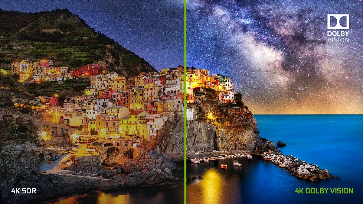
A big part of any TV device is the picture and audio quality. The SHIELD TV supports both Dolby Vision and HDR10. Dolby Vision is arguably better than HDR10 as it includes metadata for dynamic adjustment of HDR based on the scene, but HDR10 is support allows for broader content support. Dolby Vision support is a big deal as it’s a feature that users have repeatedly asked for on older models. During a briefing, NVIDIA was asked if it plans to bring Dolby Vision support to older devices, but the company said that it wouldn’t be able to due to technical limitations.

Sadly, there’s no VP9 Profile 2 support for HDR content in YouTube as NVIDIA says the processor doesn’t support it. The device is capable of supporting HDR10+, but NVIDIA was unable to confirm if either SHIELD will be updated to support it in the future.

Unlike the previous models which only had passthrough support for Dolby Atmos, the new SHIELD now features proper decode support for Dolby 5.1 surround sound. That means you’ll get proper Atmos support in Netflix. Dolby Digital Plus, Dolby TrueHD, DTS-HD, and DTS-X support are also present on both new SHIELD devices.

AI Upscaling

Thanks to the improved Tegra X1+ SoC, NVIDIA is using AI for real-time upscaling of video and gaming content, which the company claims is a first for streaming media players. NVIDIA trained a convolutional neural network (CNN) to predict the difference between high-resolution, original 4K reference videos and linear scaled videos. Then, NVIDIA put the trained model on the processor to have it upscale any content that is 720p or 1080p (up to 30fps) to a higher quality than is possible with traditional upscaling (such as bilinear). For example, HD content can be upscaled to near-4K quality.

You can preview how it looks in real-time with a slider by enabling the AI demo mode, but if you aren’t a fan of how it looks, you can disable it entirely in settings. It works with top video streaming services like YouTube, Netflix, Amazon Prime Video, etc., but it also works with games. You can adjust the Detail level in this AI-Enhanced mode between Low, Medium, or High.

Besides this AI-Enhanced mode, there’s also a standard Enhanced mode that’s new to the SHIELD TV 2019. It’s an improved upscaler compared to the “Basic” mode that’s present on the 2017 model, and it works on all video content, even content running at up to 60fps.

Android 9 Pie with Android TV

NVIDIA is a strong partner of the Android TV ecosystem, so both SHIELD TV products are built with the latest version of Android TV. NVIDIA promises an ad-free, customizable home screen. Both devices feature full Google Cast support, the redesigned Google Play Store shown off at Google I/O, Google Assistant with custom routines, and a range of music services, including the recently-added Amazon Music. Both devices even work with Amazon Alexa voice commands, provided you have Alexa-enabled smart speakers or displays. Finally, when Disney+ launches, it’ll be on SHIELD TV with Dolby Vision and Atmos support.

Since the last SHIELD TV was released in 2017, cloud gaming has significantly matured, so of course, NVIDIA is touting its own GeForce Now game streaming service. At launch, GeForce Now provided a small catalog of games to stream, but it’s since moved to a “bring-your-own-game” model so you can play games like the recently released Fortnite Season 2 on the SHIELD. Although GeForce Now is still free since it’s in beta, there’s a waitlist to gain access to the service. If you’re already in the beta, you’ll be able to immediately play on the new SHIELD TV, but if you haven’t joined yet, you’ll have to wait around 1-2 weeks in most regions to get in. NVIDIA hasn’t settled on any formal pricing for the service, but they’ll share more information when it’s ready for commercial launch. As for Google Stadia, it should eventually come to the device if Google’s Android TV update roadmap pans out, but NVIDIA had little to say on this matter.


SHIELD TV Streaming Stick

NVIDIA SHIELD TV 2019 stick

The SHIELD TV streaming stick, which is officially called just “SHIELD TV,” is the cheaper of the two new devices. The name is familiar, but this is a radically new form factor for the SHIELD TV lineup. Instead of a typical set-top box, the SHIELD TV is a cylindrical dongle that hangs out of sight. It was designed so that it can be pulled away from behind the TV because WiFi can have trouble penetrating TVs. If you have to hang it behind a TV, though, the dongle has a gigabit Ethernet port. Besides the aforementioned Ethernet port, the available ports include an HDMI port with CEC, a microSD card slot, and a power port.

Rounding out the specs, the SHIELD TV stick has 8GB of internal storage, 2GB of RAM, 802.11ac Wi-Fi, and Bluetooth 5.0 LE. NVIDIA says the device has enough storage for “50-70 streaming apps,” leaving nearly 5GB of usable storage for user-installable applications.

For the most part, this is a streaming stick that has all the bells and whistles of a full-blown set-top box. It’s available for $149.99 starting today both online and in retail stores in the United States, Canada, and Europe.

SHIELD TV Pro

NVIDIA SHIELD TV Pro

Next up is the SHIELD TV Pro. NVIDIA is billing this as a device “built for enthusiasts.” They say it was built for the most demanding media and gaming consumers. This is the SHIELD you want if you’re interested in storing a media collection, playing demanding games, or having a smart home hub. The SHIELD TV Pro has all the features mentioned earlier, but it’s in a more traditional set-top box form factor.

On top of all that, though, the Pro model has a few upgrades. RAM is bumped up to 3GB, storage is bumped to 16GB, and there are two full-sized USB 3.0 ports. You can use these to plug in a SmartThings Link to turn the box into a smart home hub. The SHIELD TV Pro also has Plex Media Server built-in and it supports 1080p transcoding. You can easily record gameplay, broadcast gameplay to Twitch, or play a bevy of high-end titles from NVIDIA’s catalog of AAA ported games, including Half-Life 2, Portal 2, Borderlands 2, Resident Evil 5, etc., exclusively for the Pro model.

You can get the SHIELD TV Pro for $199.99 starting today both online and in retail stores in the U.S., Canada, and Europe. There’s no 512GB storage model because NVIDIA points to the ability to adopt external storage as internal storage (a native feature of Android), the added NAS support, and low demand for high local storage.


New Remote, Bring Your Own Controller

If you’ve used a SHIELD TV before, you probably understand why I saved the remote for last. The old remote was arguably the worst thing about the SHIELD TV. It was flat, very small, and didn’t have many buttons. Thankfully, NVIDIA has completely redesigned the remote this time, and it comes in-the-box for both the SHIELD TV and the SHIELD TV Pro.

The new SHIELD remote looks a lot more like a traditional TV remote. It’s thicker and kind of triangular. It also has many more buttons and it takes 2 regular AAA batteries. There is a microphone for voice controls, motion-activation to activate the backlight on the buttons when you pick up the remote, an IR blaster for controlling TVs, Bluetooth, and a lost remote feature. The buttons include power, play, record, pause, forward, reverse, volume, Netflix, voice commands, a circular direction pad, and on the top right, a customizable button with up to 40+ actions.

NVIDIA confirmed to us that they considered the possibility of selling the stick model without the remote for a lower price, but they ultimately decided against it because of the strong desire for folks to have a physical remote. For those of you with an older SHIELD looking to buy this remote separately, it’ll go on sale later this year for $29.99. Again, it comes in-the-box with the SHIELD TV and SHIELD TV Pro, so you won’t have to buy it separately if you buy either of the new devices.

Last but not least is the controller, or rather the lack thereof. There’s no included SHIELD Controller this year. You can buy the existing SHIELD Controller from NVIDIA to use as a game controller, or you can use your existing XBOX One Wireless, DualShock 4, or other Bluetooth controllers. NVIDIA says the new SHIELDs support a range of controllers, but there’s no guarantee every controller will work. There’s no built-in controller remapper, either, so it’s recommended you stick with a more popular controller for guaranteed support.

The post NVIDIA announces the SHIELD TV Pro and SHIELD TV streaming stick appeared first on xda-developers.


from xda-developers https://ift.tt/2Ni7xcj
via IFTTT

Moto G8 Plus First Impressions: Restoring the G-series Glory

The Moto G series was launched back in 2013 and six years in, the series is now entering its 8th generation. The original Moto G was avant-garde in the realm of affordable smartphones, but the last few generations of Moto G phones have failed to live up to that prestige. The newly launched Moto G8 Plus is here to remind us that the company still knows the craft of building great phones with competitive hardware and aggressive pricing. Succeeding the Moto G7 Plus that launched in February of this year, the Moto G8 Plus brings refreshed internals, three cameras, stereo speakers, and a sizeable battery. I’ve been using the device for the past two days and here are my first impressions.

Moto G8 Plus XDA Forums

Note: The Moto G8 Plus review unit was loaned to us by Motorola India.

Moto G8 Plus: Specifications

Specification Moto G8 Plus
Dimensions and Weight 158.35 x 75.83 x 9.09mm; 188g
Display & Design
  • 6.3″ FHD+ (2280 x 1080) IPS LCD, 19:9
  • Waterdrop notch
  • Water repellent design
SoC Qualcomm Snapdragon 665:
  • 4x Kryo 260 Gold @ 2.0Ghz +
  • 4x Kryo 260 Silver @ 1.8GHz

Adreno 610

RAM and Storage 4GB+64GB;
Expandable through dedicated microSD card slot
Battery & Charging
  • 4,000 mAh non-removable
  • USB Type C
  • USB 2.0
  • 15W TurboPower charger (included inside the box)
Software  Android 9.0 Pie
Camera
  • 48MP, f/2.0, primary camera; 1.6µm
  • 16MP f/2.2, 117-degree ultra-wide angle; 2.0µm
  • 5MP f2.2, 1.12µm depth sensor
  • 25MP f/2.0 front camera; 1.8µm
Audio
  • Stereo speakers
  • Dolby Audio
  • FM Radio
Connectivity
  • Bluetooth 5.0
  • NFC
  • Wi-Fi 802.11, 2.4GHz + 5GHz
  • GPS, A-GPS, GLONASS, Galileo
  • 4G FDD LTE band: 1/2/3/4/5/7/8/18/19/20/26/28;
    TDD LTE band: 38/40/41

The Moto G8 Plus is a departure from its predecessor in terms of design and it looks more like an offshoot of the Moto One series with its minimalist aesthetics and familiar camera setup. Motorola briefly experimented with hole-punch design on the Moto One Vision and Moto One Action, but on the Moto G8 Plus the company is sticking to the less obnoxious waterdrop notch.

Motorola Moto G8 Plus

The back is made out of plastic — although its glossiness may fool you to mistake it for glass. As for someone with sweaty hands, the back was covered with fingerprints and smudges in no time, but thankfully there’s a clear case included in the box that should help out as basic defense against scratches and smudges. The back is curved on its sides and provides a nice, snug grip and despite the glossy finish, the device doesn’t feel slippery

Motorola Moto G8 Plus

The Moto G8 Plus comes in two colors: Cosmic Blue and Crystal Pink. Our unit is the Cosmic Blue which features a pleasing gradient hue that turns from dark Navy Blue to Space Blue when you see it from different angles under direct light. As it’s the tradition with Moto devices, there’s also a water repellent coating on board to protect the device against accidental liquid spills and water splashes — but don’t go swimming with it or dunk it in a fish tank as it’s not waterproof!

On the display front, we’re not seeing much difference from the previous generation. The Moto G8 Plus has a slightly bigger 6.3-inch IPS LCD with the same Full HD+ 2280×1080 resolution. The display is set to Saturated mode by default which provides punchy colors but you can switch to Boosted or Standard mode if you prefer accuracy over vividness. The max brightness is good enough when using the device outdoors on bright sunny days. However, just like the Moto One Action, the minimum brightness level is too harsh for comfortable late-night reading. I’m not sure if this is a limitation of AOSP or just Motorola setting the minimum brightness level too high. I used an app called Dimly to get around this issue which lets you lower the brightness level beyond the default lowest setting by putting an overlay.

Motorola Moto G8 Plus

The Moto G8 Plus is very clean looking. On the front, the company has removed the Motorola branding from the bottom chin which was there on the Moto G7 Plus. The only bit that gives away Motorola’s association with the device is the Moto batwing logo on the back which is nestled inside the fingerprint reader. The top left corner harbors the rear camera system which is akin to the one on the Moto One Macro. The Action camera — borrowed from the Moto One Action — takes the prominent position while the 48MP primary sensor, 5MP depth sensor, laser autofocus module, and an LED flash are housed in a vertical strip just beneath it.

Motorola Moto G8 Plus

On the right side are the physical buttons while the hybrid SIM tray can be found on the left. Buttons are easy to reach and provide good tactile response; the power button is textured to tell it apart from the volume keys. Motorola isn’t taking away the convenience of wired audio yet so you still get a 3.5mm audio jack which is located up top beside the secondary microphone. On the bottom, we find the primary speaker, USB-C port and the microphone.

Motorola Moto G8 Plus

Overall, I like the simplicity of the Moto G8 Plus. It’s not very flashy and funky but still manages to look aesthetically pleasing.

The Moto G8 Plus is powered by the Qualcomm Snapdragon 665 SoC, paired with 4GB of RAM and 64GB of storage. While not the most powerful chipset in this price segment, the Snapdragon 665 is a capable driver and can be found inside the likes of the Redmi Note 8 and Realme 5. During my limited usage, the device felt extremely quick and snappy — just like you would expect from any other brand new device in this price range. It’s tough to gauge the full performance potential of a smartphone in such a short period, so this is something that we will touch upon at greater length in our future analysis.

It’s a shame the Moto G8 Plus is shipping with the same version of Android as its predecessor — Android 9.0 Pie. The company hasn’t commented on when it plans to update the device to Android 10 but given the company’s recent track record with software updates, we’re not expecting anything anytime soon. We are open to being pleasantly surprised though.

Some small changes aside, the overall software experience on the Moto G8 Plus is no different than the one on Motorola’s Android One-powered devices. You’re looking at a pure vanilla Android with Motorola’s touch of useful customizations, and unlike several other OEMs that release products in this price range, there is very little bloatware and no system-level ads. The Moto G8 Plus offers additional Moto Actions which are missing from the Android One experience. This includes the screenshot editor feature to edit, crop, and share screenshots on the go; Flip for DND to silence an incoming call by turning the device face down, and Pick up to silence action that mutes the incoming call when you lift the device from the table. Additionally, you can also set the volume up and down key to change tracks when the screen is off/you press and hold the key or you can minimize the screen to the left or right corner with a swipe gesture for better one-handed usage.

The three rear cameras are in charge of the photography department. The 48MP primary camera is a Samsung GM1 sensor that combines 4 pixels into 1 to produce 12MP shots with supposedly increased light sensitivity and details. A couple of shots we took in well-lit scenes showed good detail retention and impressive dynamic range. The autofocus is really quick and accurate, too, thanks to the duo of laser-assisted autofocus and PDAF.

You can check out the full images in the Flickr gallery below:

Moto G8 Plus — Daylight Shots

For low-light photography, Motorola is including its Night Vision mode which takes a series of shots with different exposures and stacks them together to produce a final shot that has better highlights and shadow details. The effect isn’t as dramatic as something like Google’s Night Sight but it does make a noticeable difference when shooting in low-light and dark scenes. It’s hard to comment on the low-light performance based on a few samples but for what it’s worth, early results do look convincing for a product in this price range. We’ll be taking an in-depth look at the overall camera performance in a later article.

The part that impressed me the most on the Moto G8 Plus is the Dolby tuned stereo speakers. To simply put: it’s mind-blowing. I have yet to come across a phone in this price range that offers such rock-solid sound output. Motorola claims the speakers are twice as loud when compared to a mono speaker on competing devices and while I can’t really test that claim, I can confirm that they are very loud and can easily blow any single bottom-firing speakers out of the water. The stereo setup uses a bottom-mounted speaker and a front-firing speaker, located above the front camera, to create an immersive surround sound experience when watching movies or playing games like PUBG. While listening to my podcasts or watching YouTube videos, I found myself reaching less often for my trusty headphones and opted to route everything through the speakers as they sound captivating. I would even go as far as saying the speakers alone makes the Moto G8 Plus worth buying if you cherish good audio capabilities in this budget.

The supplied 15W charger isn’t the fastest we have seen in this segment but it’s still better than the 5V/2A one we got on the Moto One Action. I only had to charge the device once during this period. It took about one and a half hours for the battery to go from 20% to 100% using the supplied charger.


Concluding Note

While the Moto G7 Plus seemed hopeless in the face of fierce competition from Xiaomi and Realme, the Moto G8 Plus goes back to its roots in an attempt to bring back the gusto and vigor that was so peculiarly missing from the previous Moto G generations. To that end, the Moto G8 Plus is a substantial improvement over its predecessor and for the first time in a long while, it feels like the Moto G series isn’t painfully lagging behind the curve. In price-sensitive markets such as India, the Moto G8 Plus will find itself between crushing competition where the likes of Xiaomi, Samsung and Realme have the upper hand. The recently released Redmi Note 8, for example, offers very similar specifications with a better-looking design while still costing ₹3,000 less. The Moto G8 Plus can boast its powerful dual speakers, cleaner software experience and NFC as its advantage but whether these advantages are worth paying the premium is something that is up to consumer preference and priority.

On the other hand, the Moto G8 Plus has a better chance of succeeding in Europe, the UK and the US (if it launches in these regions) where Motorola has historically done better with its Moto G and E series of the lineup and where the price war isn’t on such an insane level.

We should have more thoughts on performance, camera, battery and the overall experience of the device in our future analysis so stay tuned.

Moto G8 Plus XDA Forums

The Moto G8 Plus goes on sale in India, the UK, and Europe at a price of ₹13,999 (~$198), £232 and €269 respectively. In India, the phone can be purchased from Flipkart.

The post Moto G8 Plus First Impressions: Restoring the G-series Glory appeared first on xda-developers.


from xda-developers https://ift.tt/2MTbPrC
via IFTTT

Xiaomi Mi CC9 Pro confirmed with 108MP camera and 5X optical zoom, launching on November 5 alongside Mi Watch and Mi TV 5

The smartphone world never sees a slowdown on releases, as we simply move on from one hyped smartphone to the next. The constant pressure to innovate and differentiate leads to shorter product cycles and more frequent releases, which allows consumers to experience newer technologies quicker. Xiaomi has now confirmed that its next smartphone is the Mi CC9 Pro, confirmed to be coming with a 108MP camera, penta-rear camera setup with quad-LED flash and 5X optical zoom, and will be announced on November 5 alongside the Mi TV 5 series and Mi Watch.

Previously, we had reported how Xiaomi was working on four smartphones with a 108MP rear camera setup. One of these smartphones was released in the form of the Xiaomi Mi Mix Alpha. Now, Xiaomi is gearing up to launch its second 108MP camera smartphone in the form of the Mi CC9 Pro, as revealed in the official teaser of the device. In the teaser, we can spot that the Mi CC9 Pro will come with five rear cameras, of which the primary camera will be the 108MP Samsung ISOCELL Bright HMX sensor. We can also spot the words “5X Optical” printed on the side, which ties into our previous report of Xiaomi working on a smartphone with a 5x telephoto camera and 50x digital zoom. Interestingly, the phone also has quad LEDs for flash, in case you use your phone’s LED flash for clicking photos in poorer lighting conditions.

Xiaomi is also teasing a new smartwatch, which is expected to be called the Mi Watch. Unlike the Mi Band 4 and releases from Amazfit, the Mi Watch is expected to be a true smartwatch, and not just be a smart bracelet with a large display. The teaser suggests that the Mi Watch will have a design similar to that of the Apple Watch, complete with a crown button on the side.

Xiaomi is also preparing to launch a new TV lineup, teasing the new Xiaomi Mi TV 5 series.

The new Xiaomi Mi CC9 Pro, Mi Watch and Mi TV 5 series will be announced on November 5, 2019, at an event in China. It remains to be seen if the devices will make their way outside of China before the new year.

Source: Weibo (1), (2), (3)

The post Xiaomi Mi CC9 Pro confirmed with 108MP camera and 5X optical zoom, launching on November 5 alongside Mi Watch and Mi TV 5 appeared first on xda-developers.


from xda-developers https://ift.tt/2pVyB98
via IFTTT

dimanche 27 octobre 2019

Google tests Scheduling and Taking a Break from Focus Mode in Digital Wellbeing

Back at Google I/O earlier this year, Google unveiled new features for Digital Wellbeing, the company’s digital wellness tool that’s now required on all Android devices. The most notable of the two features is Focus Mode, a toggle that blocks access to selected apps to eliminate distractions. In its current implementation, Focus Mode is fairly basic as it can only be manually toggled from within Digital Wellbeing or from a Quick Settings tile. However, we’ve enabled two new enhancements to Focus Mode in the latest Digital Wellbeing beta that should make it more useful.

An APK teardown can often predict features that may arrive in a future update of an application, but it is possible that any of the features we mention here may not make it in a future release. This is because these features are currently unimplemented in the live build and may be pulled at any time by the developers in a future build.

Scheduling

As we spotted late last month, Google is working on a scheduling feature for Focus Mode. Once this feature goes live, you’ll be able to choose a start and end time as well as the days of the week during which you want Digital Wellbeing to automatically enable Focus Mode. About a minute before entering Focus Mode, Digital Wellbeing will post a notification asking if you’re “ready to focus.” You can either wait a minute to let Focus Mode automatically start, or you can tap on the “wait” action to postpone Focus Mode for 10 minutes. Once Focus Mode starts, the notification text updates to tell you when it’ll automatically turn off. The Focus Mode Quick Setting tile also shows scheduling information in the subtext.

Digital Wellbeing Focus Mode Schedule

Taking a break

If you noticed in the last screenshot above, there’s a new “Take a Break” action in the Focus Mode notification. This feature, as we previously covered, was first spotted by Jane Manchun Wong through her analysis of Digital Wellbeing. The “take a break” action lets you take a 5, 15, or 30 minute-long break from Focus Mode. There’s not much of a point in taking a break when manually toggling Focus Mode, but it may come in handy when you’ve set up a schedule that you generally want to stick with but simply can’t at the moment.

Digital Wellbeing Focus Mode break

Neither feature is currently live in Digital Wellbeing on any of the other devices that I have. Since these features are fully implemented, it shouldn’t take long for them to rollout. We’ll let you know when that happens.


Thanks to PNF Software for providing us a license to use JEB Decompiler, a professional-grade reverse engineering tool for Android applications.

The post Google tests Scheduling and Taking a Break from Focus Mode in Digital Wellbeing appeared first on xda-developers.


from xda-developers https://ift.tt/2MTLDgc
via IFTTT

Google quantifies how much faster Android 10’s new Share menu really is

The Share menu is one of Android’s best features, but for years, it’s been plagued by a design that’s just plain slow. The problem with Android’s clunky share menu stemmed from Android 6 Marshmallow when Google introduced Direct Share, a feature that allows users to directly share content to the relevant part of an app. When a user shares any item in an older Android version, the system starts building a list of shareable targets on-demand. If the user has hundreds of apps installed, many of which may have applicable direct share targets, then the loading speed of the share menu could suffer. Thankfully, Android 10 replaces Direct Share with the new Sharing Shortcuts API and deranks apps in the Share menu that still use the older APIs. The new API lets apps publish their direct share targets in advance, so the share menu no longer has to reactively pull share targets. As a result, when the user goes to share any item in Android 10, the share sheet should appear much faster than before.

Ask anyone who’s on Android 10 and they’ll say the share sheet speed has been significantly improved. There’s little doubt that it’s faster, but how much faster is it in reality? With each new Android release, Google makes a bunch of under-the-hood tweaks that promise to speed up parts of the OS, but it’s rare we get to see such improvements get quantified. At the Android Dev Summit this past week, Artur Tsurkan, a Product Manager at Google, shared a graph that compares the loading performance of the Share UI between Android 9 Pie and Android 10. The graph shows the percentage of overall users (in this study) who can see the share sheet versus the time it took for the share sheet to become visible. The users are divided into two groups: those running Android 9 Pie and those running Android 10. We don’t know how Google collected this data or what the sample size is, but we assume this data was collected as part of an internal study to quantify the share sheet improvements in Android 10.

The results are certainly impressive. 27 milliseconds after initiating the share action on a file, 50% of Android 10 users can see the share UI in comparison to only 9% of Android 9 Pie users. At the 103 millisecond mark, nearly every Android 10 user can see the share UI versus nearly half of all Android 9 Pie users. Of course, how fast you can see the UI depends on multiple factors including how many apps you have installed, what kind of content you’re sharing, how many applicable share targets are available, and the speed of animations on your device, but this graph shows that the vast majority of people will see an improvement in the share sheet loading speed in Android 10.

You can watch the full talk, titled “Supercharge Sharing to your App” on YouTube down below.

The post Google quantifies how much faster Android 10’s new Share menu really is appeared first on xda-developers.


from xda-developers https://ift.tt/2NtS0X1
via IFTTT

Samsung follows Apple and adds front facing slow motion ‘slofie’ videos in One UI 2

At the beginning of this month, Samsung announced a beta program for One UI 2 based on Android 10 for the Samsung Galaxy S10, Galaxy S10+, and Galaxy S10e for users in South Korea, which was then expanded to unlocked devices in the USA and possibly other regions too. The beta gives us a glimpse into some of the upcoming features that will make its way to the stable update, including features such as Dark Mode for more apps, Focus Mode within Digital Wellbeing, less intrusive alerts for calls and volume changes, and more. As it turns out, Samsung has also added in front-facing slow-motion videos in the update.

Samsung Galaxy S10 XDA Forums || Buy Samsung Galaxy S10 from Amazon.in

Apple pulled slow-motion front-facing videos into the limelight with the iPhone 11’s “slofie” feature, which essentially allows you to record a very short video that is slowed down for playback. While one can debate the utility of what is a highlight feature on the new iPhone, it is standard behavior for Android OEMs to bring over similar functionality to their customers. As reported by SamMobile, Samsung has done the same by including front-facing slow-motion videos in the latest One UI 2 update, but thankfully excluding the ridiculous marketing name.

The preview recorded by SamMobile shows off a bit of jitter through the video, but since this is the first iteration of the feature, we can expect the same to be ironed out in the stable release of One UI 2. Much like the slow-motion video mode for the rear camera, there are no customization options for front-facing slow-motion before you begin recording. You can, however, reduce the playback speed even further later on after recording.

It remains to be seen how many users actually end up using the feature on a regular basis. But at least if you ever need it, it’s there without needing any other additional app.


What are your thoughts on “slofies”? Do you think it is a worthy addition to One UI 2? Let us know in the comments below!

Story Via: SamMobile

The post Samsung follows Apple and adds front facing slow motion ‘slofie’ videos in One UI 2 appeared first on xda-developers.


from xda-developers https://ift.tt/2JpLmzG
via IFTTT

samedi 26 octobre 2019

Skip the wait: Enable RCS right now in Google Messages for any carrier

As we all know, the messaging situation on Android is a bit of a mess…at least in the United States. While most of us in the U.S. still use SMS, the rest of the world has shifted to better messaging services like WhatsApp or Telegram. It’s not easy to convince your friends and family to switch to a new chat app, so a lot of power users in the U.S. are banking on the SMS to RCS transition to improve the messaging situation. Despite Google’s best efforts, the company has only managed to enable RCS for all users in the UK and France, two markets where it’s not as desired. Thanks to a couple of Redditors, there’s now a way to force enable RCS on any carrier or device, provided you’re using Google’s Messages app.

Redditors /u/sh0ch, /u/LinkofHyrule, and /u/NashRadical collectively shared a method on how to enable RCS over on the /r/UniversalProfile subreddit earlier today. The method is quite simple, and I can confirm it works on my own Google Pixel 4 operating on T-Mobile USA. It also worked for XDA Contributor Max Weinbach on his Samsung Galaxy Fold operating on T-Mobile. We were able to start a messaging session with read receipts, typing indicators, and all the other Chat features.

Here’s all you need to do to get this working:

Requirements:

Steps:

  1. Turn off WiFi.
  2. Open the Activity Launcher app.
  3. Tap the dropdown up top and switch from “recent activities” to “all activities.”
  4. Scroll down to find “Messages.”
  5. Tap on it and find the “Set RCS Flags” activity. Select it to open the hidden RCS configuration settings in Google Messages.
  6. Select the dropdown under “ACS Url” and select the ‘https://ift.tt/32N1XVS; option.
  7. Go home and clear Messages from your recent apps list. Open it back up and you should see a message at the bottom asking you to set up Chat. Accept it by tapping on “upgrade now.”
  8. After starting setup, re-enable WiFi and wait a few minutes. If successful, go to Settings > Chat features and it should say “Status: Connected” up top.

Troubleshooting:

If that didn’t work for you, then try these additional steps:

  1. Go to Settings > Apps and find “Carrier Services.” It’s a system app, so you’ll need to tap on the overflow menu and select “show system apps.”
  2. In Settings > Apps, find Messages and force stop it.
  3. Repeat steps #1-6 from above, but while you’re in the RCS configuration settings, expand the OTP Pattern dropdown and select ‘Your\sMessenger\sverification\scode\sis\sG-(\d{6}).’

I had to follow these last 3 steps to get it working on my own device, personally. A ton of people have already reported success following these steps. Perhaps Google is getting ready for a broader rollout of RCS after the recent announcement from the 4 major U.S. carriers.

The post Skip the wait: Enable RCS right now in Google Messages for any carrier appeared first on xda-developers.


from xda-developers https://ift.tt/2JmT3Xu
via IFTTT