
Google appears to be quietly rolling out a brand new logo and app redesign to Google Photos. The new logo and design are live now for the iOS app, and the app was previously nearly identical across platforms, so it should be coming to Android too. Below, you can see a before and after of the app listing in the Apple App Store.

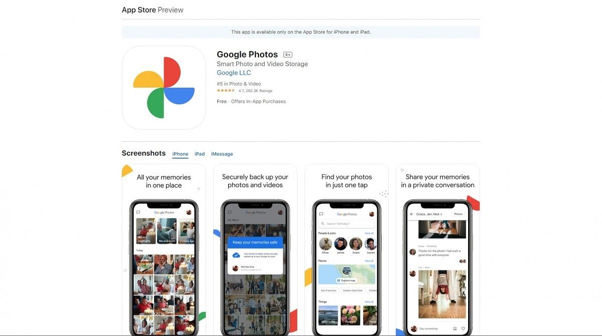
The new logo is the first thing that jumps out. It’s like they flattened the old logo and rounded all the corners. The changelog for Google Photos 5.0 on iOS reads: “Introducing a new, simplified Google Photos to help you find and relive your memories. As part of this, we’ve refreshed the Photos icon to reflect the new, simplified product experience.”


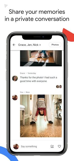
The Android app likely won’t look exactly like the iOS screenshots above, but they were very similar before. The iOS app had the typical search bar across the top, which has now been replaced with the simple “Google Photos” wordmark. There is now a shortcut to the built-in messenger in the top left corner, which suggests Google will be putting more emphasis on the feature. The “Memories” row is now larger as well.
Other than that, this seems like a fairly simple refresh. The app looks a little cleaner and more streamlined. People will probably be hesitant about the new logo, but I actually think it’s a nice refresh as well. It matches up with Google’s previous logo redesigns nicely. At the time of writing, the Android app and Play Store listing for Google Photos have not been updated yet.
Google Photos (Free, Google Play) →
Via: Justin Duino
The post Google Photos is getting a new logo and a simpler app design appeared first on xda-developers.
from xda-developers https://ift.tt/2YvP7vi
via IFTTT
Aucun commentaire:
Enregistrer un commentaire